 |
| This should at least help prove my point. |
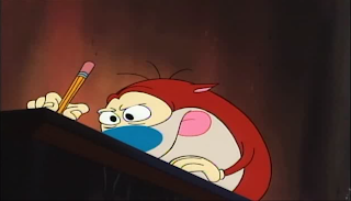
We layout game backgrounds. Attempting to correct them to fit the entire screen is tedious. We have to make sure the layouts will correctly fit the television screen. After the layout is done, we take it over to the production section of our small studio. Next, we put this on the computer and lay out the ink and paint. This is very difficult, considering that we have to include edge enhancement and make the encoding is expertly precise and clear. Inking it is the worst, you'd spend a good couple of hours just TRYING to get it correct, let alone perfect it.
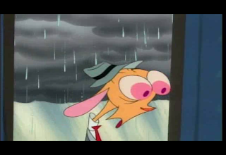
Appropriately, after inking the whole project, we have to take the finished paper and shoot it on the correct screen format. My buddy Ren Hoek here will run through all the screen formats we go through, and which one's appropriate for the final shooting.
 |
| 4:3 Non-Anamorphic NTSC Widescreen |
 |
| 16:9 non-anamorphic HDTV NTSC widescreen |
 |
| 1:85:1 anamorphic NTSC widescreen |
 |
| 2:35:1 Non-Anamorphic NTSC Fullscreen |
 |
| 4:3 non-anamorphic OUT NTSC-to-PAL fullscreen |
 | ||
| 16:9 non-anamorphic OUT NTSC-to-PAL fullscreen |
The United Kingdom version of video games will all go through NTSC-to-PAL standard changes, anyhow, so for those in Great Britain playing Black Ops, it's slightly different than the usual NTSC.
We also have to sharpen the image.
Examples of Sharpened images, differences from NTSC and PAL
If you zoom in on the pictures, you'll know which one's better.
Next, we have to process it through the Digital Painting system. The beginning of said art production begins in SECAM format, then formatted to NTSC. Here's an example of SECAM in-production:
And post-production, into the PAL version:
As you can tell, the SECAM version greatly suffers from brightness and edge enchancement. The PAL format fields stay focused and far less bright, making a sharper picture.
Here's the PAL pre-production:
And the finished NTSC version:
The finished version looks a little better. The PAL looks better at post-production, but after the animation design is finished, the NTSC looks more preferable.
As I mentioned before, the fields can really jump up and down, causing brief random blurs, brightness, or darkness.
Here's an example of fields in PAL version:
Other formats, such as the NTSC version, these brief vibrancies can be a bit distracting, as shown here:
However, the NTSC and PAL formats only make these very brief, and if you're not eagle-eyed unlike the people here at TF141 Media, they're hard to spot.
PAL-to-SECAM format, however, can have field bounces last up to six-seven seconds. Example:
It may look better than the NTSC to the untrained eye, but let it last and it'll be distracting.
Transferring said SECAM-to-NTSC is even worse, because the field jumps can transfer onto the clean protection master. This can spread onto television shows pretty easily.
SECAM-TO-NTSC
Making a SECAM-to-PAL is a lot better. Example:
Cartoons that are "digitally remastered" can REALLY suffer from this problem. Here's an example:
PAL-to-SECAM
PAL-to-NTSC:


No comments:
Post a Comment