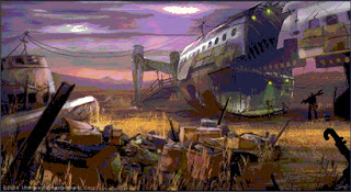
One of our jobs is to help draw some new maps we're planning for the MMO. Here's some that we worked on.
This one was shipped overseas to Masthead for coloring. This one we worked all together to help on the project itself.
FINISHED INKING
The drawing itself took about a week. The inking was a hell of a lot longer. We had to expertly scan it on a computer, and make sure it understood the image properties. Then, we could continue on inking. The program that we used was very similar to popular downloads like Photoshop. The inking took about two weeks. Later on, we had to ship it overseas to Masthead in Bulgaria in order to follow it through.
Techniques for inking:
- DON'T RUSH! You have to be careful where exactly you do so. One screw-up can really destroy an image. Try and picture what it would look like it your head, then follow through.
- Make sure you've got a good program / good inking pen.
Here's another one we worked on, but instead of inking, we had to digtally master the picture:
Here's inking before the final overseas follow:
Painting is just as difficult as inking. You have to figure out EXACTLY where to paint it, and a paint mess-up, arguably, looks a lot worse than an ink mess-up.
Tips for paints:
- Tend to stray away from the usual primary colors. Primary cyan, red, and yellow, in particular, will usually look more like an unfinished picture than usual. Try and mix up the colors if you DO use the primaries, and add a twist, like purple, orange, or green.
- Secondary colors are okay.
- Get some help from online websites or art books. Instead of yellow, try gold or towards a little bronze. Instead of cyan, try a darker blue. Instead of red, crimson.
Anyways, next up will be some updates on armor!


No comments:
Post a Comment